Modernizing the Web Experience
Eleven Fifty Academy needed a digital storefront that accurately reflected its reputation as a premier tech bootcamp. The legacy website was text-heavy, difficult to navigate, and lacked the modern aesthetic expected of a technology training institute. My role was to lead the visual and structural redesign of the website, transforming it from a cluttered information hub into a streamlined, high-converting platform for prospective students, corporate partners, and donors.
Client
Eleven Fifty Academy (Tech Bootcamp)
Role
Experience Designer Lead
Tools
Webflow, Custom CSS, HTML, Figma, Accessibility Checkers, Adobe Creative Suite, Miro, Canva
Languages
English
The Challenge
An analysis of the legacy website revealed several core UX, visual, and technical issues:
Cognitive Overload: The original navigation menu was overcrowded (Courses, Admissions, Veterans, About, Campus, Employers), overwhelming users immediately upon landing on the site.
Slow Website Performance: The legacy site was built on the WordPress platform with a large number of plugins and legacy dependencies. This created slower loading times and added complexity when attempting to optimize, maintain, and clean up the website architecture.
Outdated Visual Aesthetic: The site felt dated and relied heavily on dense blocks of text, weakening the overall brand perception and reducing user engagement.
Buried Value Proposition: Key trust signals—such as student success rates and corporate partnerships—were buried within the layout, making it difficult for prospective students to quickly recognize the program’s credibility and value.
Unclear User Journeys: Navigation pathways for different audiences (such as users interested in coding versus cybersecurity programs) were unclear and often confusing, resulting in a less intuitive user experience.
The Solution
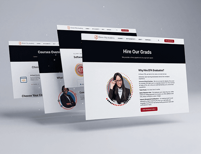
Following stakeholder discussions and a technical evaluation of the legacy website, we decided to migrate the platform from WordPress to Webflow. The move allowed us to build on a more robust, cleaner, and easier-to-maintain platform while significantly improving website speed and overall performance.
I then focused on establishing a clean, modern design system that prioritized whitespace, clear typography, intuitive navigation, and strategic visual storytelling.
A. Streamlined Information Architecture
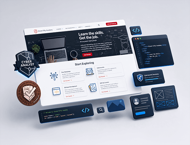
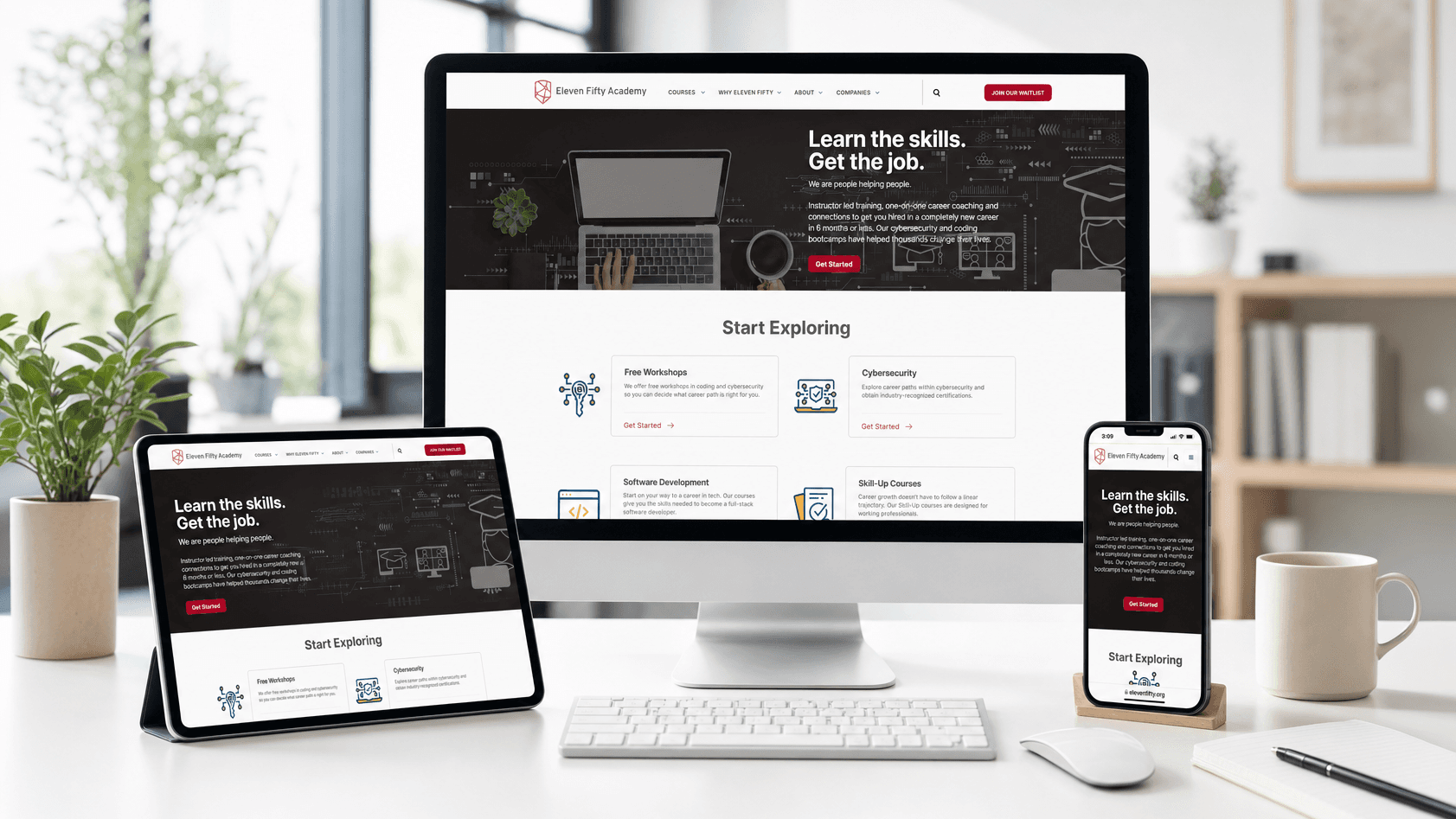
Simplified Navigation: I condensed the main navigation menu down to the essentials ("Courses," "Why Eleven Fifty," "About," "Companies," and a strong "Join Our Waitlist" CTA). This immediately reduced cognitive friction and guided users toward high-value actions.
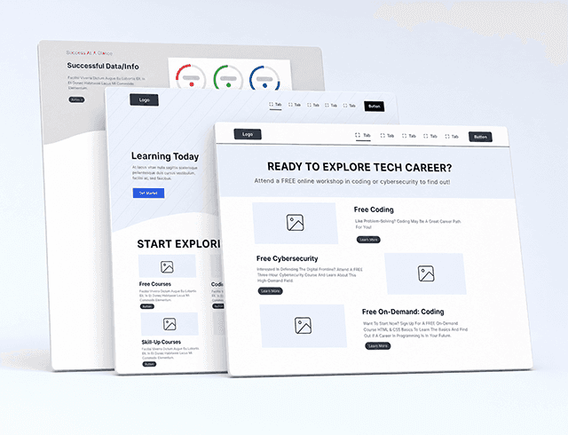
Distinct Career Pathways:I designed clear, side-by-side homepage modules that separated the "Software Development" and "Cybersecurity" tracks, allowing prospective students to quickly identify and self-select the path most relevant to them.
B. Modernizing the UI & Visual Language
High-Impact Hero Sections: Redesigned the homepage hero section with bold, concise messaging (“Learn the skills. Get the job.”) and modern visuals to create a stronger first impression and communicate the program’s value more effectively.
Whitespace & Readability: Increased spacing, padding, and layout structure across the site to transform dense content into highly scannable and digestible sections, significantly improving readability and user engagement.
C. Technical & Platform Improvements
Platform Migration to Webflow: By rebuilding the site in Webflow, we eliminated the heavy dependency on multiple plugins that previously slowed down the website and complicated maintenance workflows in WordPress.
Cleaner & Faster Experience: The new platform enabled a cleaner code structure, faster loading performance, improved responsiveness, and a more scalable foundation for future content updates and growth.
Outcome & Impact
Led a complete redesign of the Eleven Fifty Academy website with a focus on performance, accessibility, responsive UX, and front‑end optimization—improving Lighthouse scores from 82→97 on desktop and 37→94 on mobile, while achieving 100 Best Practices scores across the site.
The redesign elevated the Academy’s digital presence by:
Highlighting Outcomes: Conceptualized and designed a highly visual “Our Outcomes Speak Volumes” section to showcase key success metrics, including 1600+ graduates and a 92% placement rate.
Strengthening Credibility: Brought trusted partner and affiliate logos (Salesforce, Chase, Lilly, UKG) to the forefront of the homepage to build immediate trust.
Enhancing Brand Perception: Elevated the overall look and feel to reflect a modern tech‑forward institution, aligning the visual identity with the quality of the Academy’s programs.
Improving User Journeys: Simplified navigation and clarified course pathways, enabling users to find relevant information faster and with less friction.