Comprehensive Bilingual Branding
To develop a cohesive visual identity that bridges cultural heritage with a modern community presence, ensuring consistency across physical architecture and digital media.
Client
Chinese Community Church of Indianapolis
Role
Visual Identity Designer
Tools
InDesign, Illustrator, Photoshop, Figma
Languages
English, Traditional Chinese, Simplified Chinese
The Challenge
To design a cohesive and scalable brand identity that serves as a bridge between cultural heritage and a modern community presence. This required solving three core design problems:
Typographic Harmony: Developing a unified system that perfectly balances English and Chinese typography, accounting for their vastly different structural and spatial rules.
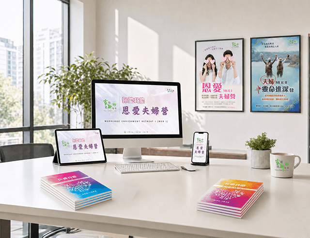
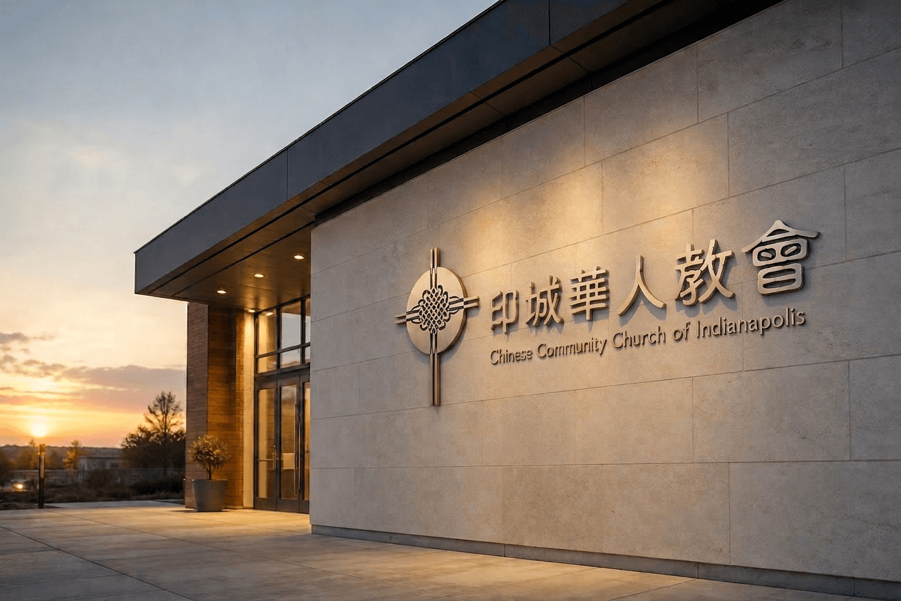
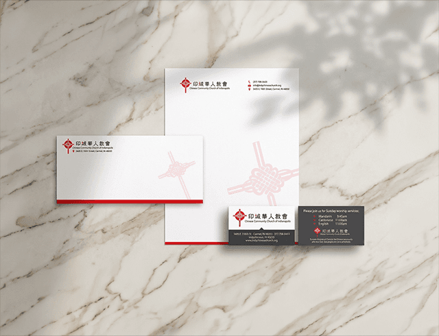
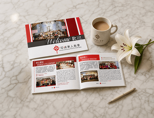
Cross-Medium Scalability: Ensuring the design remained strictly consistent and functional across drastically different touchpoints. The branding needed to translate perfectly from small-scale printed stationery and bilingual publications to monumental architectural signage.
Generational Appeal: Crafting a visual language that respects traditional cultural elements while maintaining a contemporary aesthetic to engage both older and younger community members.
The Solution
I developed a comprehensive branding system applied across the building’s signage, bilingual publications, marketing collateral, and stationery. By balancing traditional and contemporary design elements, I created a unified visual language that communicates effectively in both Chinese and English, strengthening the organization’s identity across all touchpoints.
Outcome & Impact
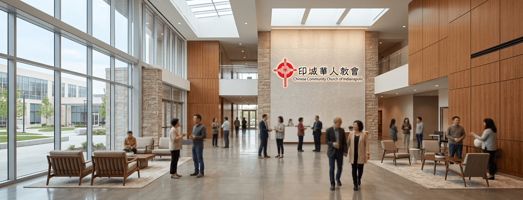
Established a Permanent Legacy: The branding system successfully transitioned from paper to architecture, with the building signage becoming a local landmark for the community.
Unified Cultural Identity: Created a "visual bridge" that allowed older and younger generations to feel equally represented through balanced bilingual typography.
Brand Longevity: The identity system has remained in active use for years, proving its durability and timeless design quality.